Color paletts in games-Your preferances
Miscellaneous Forums/General Discussion/Color paletts in games-Your preferances
I would like to discuss color paletts that you find appealing in games. I hope this thread has not been misposted.
I find that I like hand picked colors in games not just the basic system colors. By system colors i mean colors like 255,128,128 what I'm getting at is I find colors with lower saturation and an original hue very eye pleasing.
This is just my style but I prefer to keep saturation in my colores below 128 and I try to reuse colors and dither on my sprites/backgrounds. I am a pixel artist so I have some expearance in making decent sprites.
Finally I really dislike any blank black background in a game I think black as a background conveys a feeling of emptyness and when your sprites use a linear light pallette, with white as the highlight color it just makes it worse.
I'm not saying that I know everything I'm simply submitting my opinion in hopes of getting yours.
I'll gladly post my sprites if anyone is interested.
thanks for your time.
Here is a link to some of my early works. Click any image to see a full display with critiques and opinions.
http://www.pixeljoint.com/pixels/profile.asp?pg=1&id=2109&sec=iconsI would highly reccomend this site if you wish to learn pixel art. You can visit the forums there too for pixel art related discussion.
It really depends on the game, ya know... bright and sharp won't work for a kiddie-time pastel game... while, all dark and moody won't work for a bright cartoony game... conversly.. a mystery or deep drama would do well with a dark noir scheme.
You have some interesting stuff there. :)
I feel that colors used in a game can make it or break it.
I just haven't noticed any video game color usage conversations around here.
color can deff make or break the feeling and setting of a game, and can also break the gameplay if the colors around well thought out for recognising your sprites, however, that is a more utilitarian concept than an aesthetic one. I doubt that beyond that the colors would effect the gameplay itself, but certainly the game isn't only about gameplay.

just a random pixel character I did.
These are two of the same images with 2 styles of coloring,
The first required little thought while the second took some time to get looking better.

To everyone: What type of coloring style do you have, and why do you use those hues/saturation level?
Your stuff has gone from being primary coloured to being bland under the pretense that its good. Its not good. Your stuff looks bland on your website.
You seem afraid of using strong colour. It's possible to use strong colour without primary colour. If I were you I'd go a bit wild with my next few images...
Hey - the pretentious come out of the woodwork around here! Seeing more than there really is and then yapping so confidently about it!
Ryan - if you're not a natural, try emulating some good pixel art - just copy it if you have to. You'll learn more and quicker that way.
Ignore that sin unto D-paint that Dampe posted - I can't figure if he's joking with you or not.
Hey I'm just asking what people prefer and why they choose the colors they do I don't need to justify my work. I'm not trying to sa anyone is wrong ,I'm merly posting the coors I find pleasing and my opinion on color usage.
So to redirect this, What colors do you prefer in your games and why do you choose the paletts you do?
Hey - the pretentious come out of the woodwork around here! Seeing more than there really is and then yapping so confidently about it!
Don't be an idiot. I've been a full time artist for 10 years. I'm telling it like it is. I feel Ryan needs to splash some strong colours around.
OEJ: maybe he wasn't talking about you.
Ryan, your second ship looks dimmer and the bullets are too dim. Earlier today I tried a non "default" colour on some text but it didn't look so cool, it looked dim. As soon as I boosted it, it was much better. The primary colours do have their places, but I do know what you are saying about finding more interesting ones and I agree.
Colour, lighting and how you use it is one of the most important things that a lot of programmers don't understand.
Anyway, a lot of what makes something look cool comes from experimenting abit and seeing what others have done. I personaly got a bit fed up with the dark and gloomy dreary monochromatic palettes a lot games try and use. Either because of some of the limitations of normal mapping and stencil shadows, or because it's supposed to look cool.
It's all very art studenty.
I think you just have to play around some more, there are no hard straight rules really, some guidelines when starting out. I personaly like bright colours and don't go for realism so much. Realism often isn't about muting things, but getting some subtle nuiances out of how light and colour react. Like not using greyscale lightmaps and adding some depth to your scenes through colour.
Like if you look at old masters, they have an underpainting that shows through in the shadows, and rarely use black paint. ANd mix as few colours to avoit the muddy look so many amature painters come up with.
Mixing greens and reds, or reds and blues to make darker colours, adding blues and greens to skin colours, and ringing things to the forground with oranges and reds, or receding them with greens and blues.
All simple tricks you learn in painting that can help you with your game art.
yeah click my Easter Bonus link and look at the screenshots. The pixel-artist was very particular about pallettes, and I think he did a great job.
these colors are all you ever need!
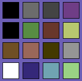
If you're making a game then your colours have to be
functional. Stronger for important foregroud objects, weaker for supportive background detail - if the player can't collide with it, it shouldn't jump out of the screen. Just opting for a blanket "everything's bright!" or "everything's washed out!" is always going to run the danger of looking like a confusing mess.
Like if you look at old masters, they have an underpainting that shows through in the shadows, and rarely use black paint.
Yeah I think I remember reading that Square avoided using black for
Seiken Densetsu 3.
OOPS! Some people have a real chip on their shoulder don't they? Getting all arty farty and pretentious wasn't really a swipe at any one in particular. Maybe I should have said - simply be your own 'honest' critic, you're sure to get better that way.
D-paint? I used ms paint for Datawave up there... ohhh... about 6 years ago.
I was trying to be supportive..
sad part is she is still in my visual art section of my portfolio... I really need to update the content -_-
Evak's response has been the most useful IMO.
I think you do need to play around a bit more with the colors, and develop a bit more range in your colors also. I think full saturation colors have their place, but can be more effective when used sparingly. In your ship above, the first image looked gaudy and the second image looked bland. A better way would be to add a bit more range into the second image, perhaps the lasers could be a full saturation, and a small section of lighter/darker color to give it more range.
Also, color has so many things that need to be considered. For example, what color is a paved road? How about skin color? There is no correct answer here, but a road is not black as many people would try to draw it, and skin color is not pink. Depending on the lighting situation, a proper looking skin color could be anything,... blue, green, purple,... With the right colors around it, it will look correct.
I just think that people need to look at colors that they are using and not use colors like a child where trees are pure green and the sky is pure blue. Oftentimes you can develope a style through slightly odd colored skies and I personally like to use a soft yellow as a lightsource sometimes. I'm just stating my preferances I'm not trying to impose them on your art.
Have a sniff around this extensive Amiga site - some great screenshots for you to crib and dissect - from the grainy rough to the sheeny immaculate.
http://hol.abime.net/top99.php retro.hack: I know those colours well :-) C64 rocked, it's colours WERE better than the Spec and Amstrad ones.