OK link removed... I've got a professional on the job.
Feedback - Current Concept.
Miscellaneous Forums/General Discussion/Feedback - Current Concept. Like the colours, don't like the blurry eye image. Would prefer a graphic done in Illustrator - i.e. something with clean sharp edges. Cannot read the similar colour text on the bar under the image.
IPete2.
IPete2.
3/10 but there's not much to go on.
Heh, the blurry image is created from the illustrator artwork :) I thought the clean crisp looked rather plastic.
@GfK, what exactly does 3/10 mean? Perhaps you could elaborate a little for me.
@GfK, what exactly does 3/10 mean? Perhaps you could elaborate a little for me.
A wee bit ambiguous to start with. I like the basic layout but I think you need to iron out that icon out a little bit..smooth out the gradient etc..I'm sure you'll get it right by just refining what you've started with here.
Oh - the the font colours near the top are bit lost aren't they?
Oh - the the font colours near the top are bit lost aren't they?
@GfK, what exactly does 3/10 mean? Perhaps you could elaborate a little for me.
Well... 3/10 means I don't like it very much.If you want me to disect it even though there isn't very much there....
First, the background with the gradient and the white horizontal bar - that's gotta go. It looks cheap.
The logo is blurred and pixelated. I guess its supposed to be like that but I just don't like the way it looks.
The blue/grey colour scheme is very dull. Your site I guess is going to be trying to advertise the fact that you're selling fun games? That colour scheme is saying to me "insurance policies", or "pensions".
The "independent software developer and publisher" text is barely legible. Why is it even there? Why is it there twice on the same line?
I think that's about it, for now.
First, the background with the gradient and the white horizontal bar - that's gotta go. It looks cheap.
Ok point taken but I quite like it. The blue/grey colour scheme is very dull. Your site I guess is going to be trying to advertise the fact that you're selling fun games? That colour scheme is saying to me "insurance policies", or "pensions".
This has nothing to do with games, this is the corporate site, games in only a small part of my business. The "independent software developer and publisher" text is barely legible. Why is it even there? Why is it there twice on the same line?
Dunno, ignore it. Well, you asked.
I thought the background was quite good and I liked the idea of the blurry image.
I didn't actually notice that there was text in the bar under the logo until someone on here mentioned it.
This is just a personal opinion but the way the main box is touching the top but has a gap at the bottom does't feel right to me. Perhaps have it spanning the whole page height? (Other people may disagree - i think i have a phobia of non symmetry or something :D)
Lighter colours might help (not too much lighter I quite like the way they are at the moment)
Also if you used english rather than latin i think it would appeal to a wider audience. (sorry I couldn't help myself)
Matthew
I didn't actually notice that there was text in the bar under the logo until someone on here mentioned it.
This is just a personal opinion but the way the main box is touching the top but has a gap at the bottom does't feel right to me. Perhaps have it spanning the whole page height? (Other people may disagree - i think i have a phobia of non symmetry or something :D)
Lighter colours might help (not too much lighter I quite like the way they are at the moment)
Also if you used english rather than latin i think it would appeal to a wider audience. (sorry I couldn't help myself)
Matthew
Indie... i think he's right about the independent software thing being too small... since it's a key message, i think it should have a bit more presence...
otherwise, it looks clean and business like for the most part...
--Mike
otherwise, it looks clean and business like for the most part...
--Mike
I'd recommend against hiding the text the way you are. That's very much frowned upon by Google. Have good content and it's not necessary anyway.
Personally I think it looks very much like a blog template and not very corporate. The colours are rather dark and the logo has become a bit muddy. I would suggest making everything lighter and simpler. As a business you want people to focus on the content.
Tell you what - give me free stuff and I'll design you a site. How's that sound?
:)
Personally I think it looks very much like a blog template and not very corporate. The colours are rather dark and the logo has become a bit muddy. I would suggest making everything lighter and simpler. As a business you want people to focus on the content.
Tell you what - give me free stuff and I'll design you a site. How's that sound?
:)
You'd best get busy then Ben. :D I think I've got sufficient credit :)
lol - already on it
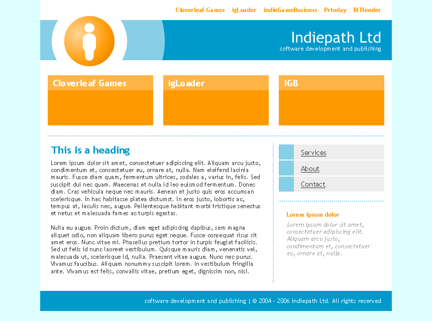
I had started before I posted :)
I had started before I posted :)
Ok but I've got a serious problem with orange and cyan. I like the Binary Moon colours, ie. Pastel Yellows and the like.
if i may... the brighter colors are a bit more inviting... nice job BM...
ahhh, i'm so confused now :)
--Mike
ahhh, i'm so confused now :)
--Mike
the colours can be changed easily. I used the blue because you were using blue, and orange because that's the colour of the logo at the moment.
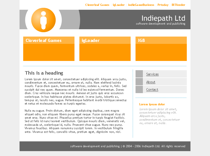
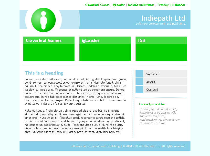
Maybe we should do this via email?
Maybe we should do this via email?
Is it possible to lose that person contained in a bubble?
It looks like a sign for the lavatory.
It looks like a sign for the lavatory.
YEah lets do this offline.
@ENAY, lol but no.
@ENAY, lol but no.
I vote for the blue/orange one or the green/blue one... Them be very nice!
Andy
Andy
> YEah lets do this offline.
You can download the internet when you're offline?
You can download the internet when you're offline?