Competition to design my logo!
Miscellaneous Forums/General Discussion/Competition to design my logo!
[EDIT] *** Competition now closed. I struck a deal with One Eyed Jack for his cool logo. ***
I asking members of the blitz community to submit a new logo for Grey Alien Games. The winner will receive £20 via paypal or cheque (U.K. only for cheques). Bear in mind if you receive money via paypal, they might take a small% as commission, I think.
[edit] I'm the judge, and my decision is final. I might not choose *any* winner, but I do hope to choose one!
I don't really need the text doing again (unless you can 100% come up with something better), just the UFO abduction thing. The reason is, I bought that artwork in and whereas the artist doesn't mind me using it, the site I bought it from says I can use it for anything EXCEPT company logos, great!
Anyway here is the original, I'll be sad to see it go, sob.

Please make sure yours is the same size.
*** What I want is a picture that is close to the original or your (sensible) interpretation of it, because I really liked the original idea. It has an abduction sound effect when it fades in in my games. ***
Also note that it may be better if you use a vector program such as corel draw, freehand etc so that in theory I can scale it and export for other future uses. If you can only make a bitmap version then fair enough, but vector would be preferred.
Oh yeah, it'll need to be antialiased to the same dark blue background I'm currently using.
Post your work here, or email it to the address in my profile.
If you enter the competition, and win, you'll need to send me an email saying you 100% pass all copyright over to me so there are no future legal wrangles, thanks. Oh, and I'll need some kind of receipt, electronic is fine.
Anyway, good luck all. I really look forward to seeing the results!
P.S. I'm still looking for nice happy, cheesy, spring-like music for Easter Bonus. See my thread:
http://www.blitzbasic.com/Community/posts.php?topic=55764 Good luck, I tried this once :(
Talk to Noel Cower, he's got some great ideas.
thanks. People have chipped in before with various design things so I thought a prize might keep their interest.
Just a thought -- you may have much better luck posting something like this on a graphic design forum somewhere rather than a programming one...
yeah thanks, just thought I'd give the community a chance as there a lots of talent artists here. I could do it myself but thought I'd save some time and hopefully get a better one.
Pitty you can't use the original image as it's pretty much perfect as a logo, IMO.
yeah, well I could try too, it's only in the small print on the site, but I don't really want to risk it.v I love it though.
I have done this proposal but as I do this for a living, I am charging £40 for it, which is the rate for the time taken.
You can take it or leave it... but if you take it, you'll get it in layers, png and psd, plus a high rez version of the saucer in PNG format wth correct alpha so you could for example zoom it on screen as a cut scene and then fade in the rest. Also I would be willing to make minor changes.
You are under no obligation to accept this, it is just entirely my risk :)

Hey thanks, I like it a lot! I suppose you could make the saucer green? The text is good too, although I also like mine. I'll wait and see what other offers come up, but I really appreciate your efforts so far, thanks. If I do choose yours I'd like to smarten up or remove the disc of light on the ground as there's something not quite right about it. I see the beam colour matches the text, but it might look nicer more yellow? I like the figure too, but I think I prefered the quizzical looking up on the original, also if it was a bit smaller it would make the ufo seem a bit bigger. The figure could actually be cartoony/stick man-ey, but it might not blend with the rendered UFO anymore. All these points are very minor, what you have made is really neat.
Anyway thanks again, stay in touch. Also I love to see your other work if you have any online. Post/email a link?
I'll email you :)
just been looking at your website, some good stuff there. Oh and if I do or don't use your logo, you have my blessing to put it on your website.
Thanks :)
One Eyed Jack's logo is great but are there any more offers?
OK, here's the final logo! Thanks One Eyed Jack.


Just like Mr. Cummings' logo, you'll get it in layers, png and psd, plus a high rez version of the saucer in PNG format with correct alpha so you could for example zoom it on screen as a cut scene and then fade in the rest.
;-p (sorry I had to do it, just a friendly joke)
Seriously, I like your inital cartoon logo better than the rendered 3D one.
Er, that 'new' logo is almost identical to the original one, IMO. I certainly don't think it's different enough to avoid copyright infringement. Just my opinion.
Er, that 'new' logo is almost identical to the original one, IMO. I certainly don't think it's different enough to avoid copyright infringement. Just my opinion.
Ditto. I think this, if discovered, may cause a few problems (not the text, the spacecraft and the man).
Well my original proposal was quite different and still available to him if he ever does :) I doubt very much it'll be a problem in this case for various reasons.
Thanks Matt, made me laugh :-)
Re: "identical". Thing is, the original artist didn't mind me using it as a logo, but I'm trying to avoid the totally small chance that someone from the corporate website selling the original artwork catches me out on the smallprint that says "not for company logos". They can't do me for using a "similar" image when it's clearly not the exact same one they are selling. There's certainly no law against making similar images (in other words being "influenced") to other ones unless its a trademark or some such official logo. I mean look at Matt's, since the 50s laods of people have drawn simialr things, in fact there were lots of simialr ones on the site I bought it from, by different artists. The figure is quite similar I admit, but it's been totally redrawn by hand and does have some variation, so I reckon I'm clear :-) Anyway, this is a case of "wait and see" if I'm discovered, if they say "desist" I can either change it or fight it (after taking legal advice).
I didn't really want to change it, and maybe many people wouldn't have bothered but I really don't want any copyright issues with my games which is why I'm very careful to read all the small print with "free" images, music and fonts before using them. I also credit the authors of everything and email them (which works as extra marketing, one of them even bought Xmas Bonus!)
It's up to you, but I really liked the text in Jack's first proposal image.
Yeah, but I don't want to change too much as the logo has been seen by >50,000 people already on Xmas Bonus. Also it's about connotations, my text is clean and crisp thus giving the impression of a "pro" game. Jack's text is also good but has a kinda sci-fi tongue-in-cheek scariness about it that doesn't give 100% the right impression for a "family game", neither does the original figure he drew, imho. If I release a shooter or arcadey platformer, then I might use it, we'll see...
Just thought I'd weigh in here.
There is no way you would be protected in this remake of the logo. It is, for arguments sake, identical. If you are truly concerned about it, I would stay clear from the original artwork, or anything close to it.
If I take a famous trademark image and trace it, I could claim that my curves were different, but it would not protect me when it's clearly obvious that it is a copy of the original.
I don't think there's a problem but he can always change the character.
Thanks for your input.
It's not "identical". The UFO's a different shape, it has different windows and a different dome and a different hole and it's raytraced. The beam is different. The figure is very similar. The text is mine. The logo size and angle is similar because those proportions work well for a left hand logo with text on the right. If I said to an artist, make me a 50s style green ufo tilted to the right with a bubble on top and a yellow beam coming out a hole in the bottom with a person looking up into it, make it this big and on a blue background, what's the betting I'd get something pretty damn similar. There are loads of very similar things all over the internet, it's a common thing, like a grey alien face, no-one's copyrighted that.
Remember, the original artist didn't mind me using his image, but the site's smallprint says can't use THAT EXACT IMAGE on a company logo, guess this is because more than one person could do it which would cause them trademark issues.
Here's some similar ones:




http://www.macclesfield-express.co.uk/ContentResources/952.$plit/C_58_Articles_94270_Body_Web_ArticleBlock0_Image.jpg
or go here:
http://www.istockphoto.com/file_search.php?action=file&text=abductedget the idea?
none of those will do :) check your email...
not trying to be difficult here, but I'm just saying it's too close to the other artwork.
The other examples of ships/abductions are quite different enough.
I make my living as an Animator/Fx artist, and I deal with logos and this kind of stuff every day. I'm only telling you that it's too close to keep yourself out of trouble, that's all. If I held the rights to the first logo, and saw the second version I would most definately be able to win any argument over the copy of the artwork.
If I took the McDonald's logo, for example,... made it 3d and put fancy reflections on it, it's still the McDonald's logo, whether it is hand drawn or raytraced makes no difference.
Anyways, like I said I'm not trying to be difficult, just trying to offer some advice. What you do with it is up to you. Just don't say you were not warned when/if it comes back around.
I have changed it enough, the character is different, doing something different, and I have introduced a second character who differs substantially. It could be any ufo situation now, and any simularities are coincidental. IMHO it is enough... waiting on Jake's response over email.
No problem,... I just figured if he was changing it to avoid any potential legal issues, then it had better be changed enough to avoid them, that's all.
Best of luck with the new logo.
Thanks Pongo, I do want it to be different enough to avoid legal issues but close enough to be like the original, tough call eh?
Anyway, as you can see by the logo above, One Eyed Jack has done a great job changing the figure, it's really neat, and of course suitably different. Hopefully that should be enough now.
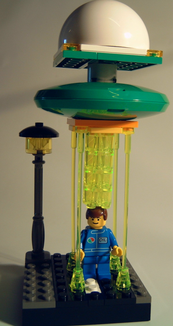
I was bored yesterday morning, so did this version and then promptly forgot to post it!

The little blokey was supposed to be kneeling in a welcoming reverence kinda pose, but he ended up looking a bit midgety instead. :o/
[edit]
Yeah, I do realise that GA is no longer after a logo but I only did this for fun and to learn how to use Expression 3 anyway.
[/edit]
Thanks Ian(?) It looks good too, the transparent beam is nice. He does look midgety I guess, but it would be hard to give the kneeling impressing unless he was side on (but then the arms wouldn't really show) so a 45degree angle may have worked best.
Thanks again, but as you've indentified, I've got one now :-)
Have you thought about a group of cute looking grey aliens playing video games? That would be a neat pic indeed, and family friendly...
yeah maybe. I also thought about someone sitting at thier PC being abducted. Anyway I don't want to do more work on it now.
I spent ages yesterday making one (anything to avoid coursework at the weekends) then saw you'd closed the compo.
Oh well, another weekend without coursework over with.
It's not a waste Muzzer, lets see your entry, I bet it's a great feather in your cap. When I did my little entry, I didn't know if Grey would accept it or not - I just did it all the same. Sometimes you feel inspired.
Coursework is your priority though, so you'll need to catch up each night, and you know best of all how vital that it is not to fall behind.
Yeah sorry muzzer. I could have left it open for longer but I really liked one eyed jack's and we seem to get on well. I'd love to see it. You are also welcome to display it on your website or print it for a portfolio or whatever, even though it's my company name.
You should try to catch up a little bit though. Hey, I try to avoid work now I'm a contractor, which is why I'm on the forums so much. Not good really, best you get out of that habit whilst you can :-)